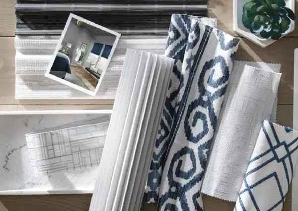

That gorgeous open-concept layout you fell in love with in Burke or Springfield comes with a design challenge most Northern Virginia homeowners don’t anticipate: every window treatment is visible from every angle. When your kitchen flows into your great room which opens to your dining area, mismatched honeycomb shades create visual chaos that undermines the very openness you paid premium prices to achieve.
Meanwhile, your Dominion Energy bills remind you monthly that those beautiful sightlines also mean massive glass expanses bleeding conditioned air. You need cellular construction for energy efficiency, but you refuse to sacrifice the design cohesion your Northern Virginia home demands. This guide shows you exactly how to coordinate honeycomb shade colors with your existing floors and walls—room by room, window by window—so your open-concept space looks intentionally designed rather than accidentally assembled.
Why Color Matching Matters More in NoVA Open-Concept Homes
The dominant architectural trend across Fairfax, Arlington, and the broader Northern Virginia market features fewer walls and more connected living spaces. According to the National Association of Home Builders, 84% of new single-family homes built since 2018 include open-concept layouts (Source: NAHB What Home Buyers Really Want Report, 2021). This means your window treatments aren’t isolated design decisions—they’re part of a continuous visual field.
The Sightline Challenge in Connected Spaces
Stand in a typical Springfield great room and count the windows you can see without turning your head. In most Northern Virginia open-concept builds, you’re looking at eight to twelve window openings simultaneously. Each honeycomb shade becomes a color block in your peripheral vision. Mismatched tones create the visual equivalent of wearing stripes with plaids—technically functional, aesthetically jarring.
Cellular shades coordination NoVA professionals understand this challenge intimately. The solution isn’t choosing one color for every window. It’s selecting colors from the same undertone family that complement your flooring and wall palette while allowing deliberate variation between spaces.
Energy Efficiency Meets Design Intent
Honeycomb shades reduce heat loss through windows by up to 40% compared to leaving windows uncovered (Source: U.S. Department of Energy Window Coverings Fact Sheet, 2022). In Northern Virginia’s climate—where summer humidity pushes cooling costs and winter cold creates significant heating demands—that efficiency matters. But you shouldn’t have to choose between lower Dominion Energy bills and a beautifully coordinated interior.
Designer Insight: The most successful honeycomb shade color matching in Northern Virginia starts not with fabric swatches but with your largest fixed element: your flooring. Your floors anchor the entire color conversation.
The Floor-First Color Matching Method
Your flooring covers more square footage than any other design element. Whether you’re working with the warm oak hardwoods common in Centreville colonials or the cool grey luxury vinyl trending in newer Burke townhomes, your floor’s undertone dictates everything above it.
Identifying Your Floor’s Undertone
Every flooring material—hardwood, tile, LVP, carpet—carries either warm (yellow, orange, red base) or cool (blue, green, grey base) undertones. Here’s the test: place a pure white sheet of paper on your floor in natural daylight. Does your floor look yellower or more orange by comparison? That’s warm. Does it look more grey or blue-ish? That’s cool.
| Floor Type | Common Undertone | Honeycomb Shade Families |
|---|---|---|
| Red Oak Hardwood | Warm (orange) | Cream, warm white, caramel, terracotta |
| Grey LVP | Cool (blue-grey) | Pure white, silver, cool taupe, slate |
| Natural Maple | Warm (yellow) | Ivory, wheat, honey, soft gold |
| Espresso Hardwood | Warm-neutral (brown) | Cream, mushroom, warm grey, chocolate |
| Porcelain Tile (white) | Cool (clean white) | Bright white, grey, coastal blue, silver |
When you visit showrooms near Fairfax Corner or the Mosaic District, bring a flooring sample or high-quality photo taken in natural light. This prevents the classic mistake of falling in love with a honeycomb shade color that looks stunning in the showroom but clashes violently with your floors at home.
Creating Your Three-Color Palette
Professional honeycomb blinds interior design Fairfax consultants work with a simple framework: anchor color, bridge color, and accent color. Your flooring is the anchor. Your walls are typically the bridge. Your window treatments can play either bridge or accent roles depending on your design goals.
- Anchor (floor): Fixed element—this doesn’t change
- Bridge (walls): Usually neutral, connects floor to other elements
- Accent (shades): Can match bridge for seamless look or contrast deliberately for visual interest
In Northern Virginia’s competitive real estate market, where the median home price reached $615,000 in 2023 (Source: Northern Virginia Association of Realtors Market Statistics, December 2023), coordinated window treatments signal quality and attention to detail that impacts both livability and resale perception.
Room-by-Room Coordination Strategies for NoVA Layouts
Not every room needs identical shades. In fact, thoughtful variation creates more sophisticated design than monotonous repetition. The key is maintaining undertone consistency while allowing value (lightness/darkness) and saturation to shift.
Great Rooms and Primary Living Spaces
Your great room typically features the largest windows and most prominent sightlines. This is where you invest in your primary honeycomb shade color—the shade that will anchor your entire home’s window treatment palette. In Arlington’s contemporary builds and Fairfax’s transitional colonials alike, this usually means a neutral that complements both your floor and your most prominent wall color.
For Northern Virginia homeowners concerned about UV fade (our region averages 213 sunny days annually according to NOAA climate data), consider cellular shades with UV-blocking properties in lighter colors that won’t absorb and re-radiate heat into your living space during summer months.
Kitchens and Breakfast Areas
These spaces often feature different flooring—tile versus hardwood—yet remain visually connected to your great room. Your honeycomb shade color here should share the same undertone family as your great room selection but can shift lighter or darker. White or cream shades work exceptionally well in kitchens because they reflect light and maintain brightness for food prep.
Bedrooms and Private Spaces
Bedrooms allow more flexibility. While you still want undertone harmony, you can introduce bolder colors or deeper saturations that would overwhelm public spaces. Custom shade colors Arlington designers often recommend room-darkening honeycomb options in richer tones like slate blue, sage green, or warm taupe for bedrooms—providing better sleep quality while still coordinating with your home’s overall palette.
- Start with your great room color as the baseline
- Select bedroom shades within the same undertone family
- Allow value shifts (lighter or darker) for visual variety
- Consider room-darkening features for sleep quality
- Test fabric samples in actual bedroom lighting conditions
Wall Color Coordination: The Sherwin-Williams Reality
Approximately 78% of Northern Virginia homes built or renovated in the last decade feature some variation of grey or greige on the walls (Source: Sherwin-Williams Professional Contractor Survey, 2022). This regional preference—think Agreeable Gray, Repose Gray, and their countless cousins—creates specific honeycomb shade coordination opportunities.
Working With Grey and Greige Walls
The good news: grey walls offer tremendous flexibility for honeycomb shade selection. The caution: not all greys have the same undertone. Your Repose Gray walls might lean purple in certain lighting while your neighbor’s Passive Grey reads green. Always test your proposed shade fabric against your actual wall color in both morning and evening light.
For homes throughout Burke, Springfield, and Centreville, where classic grey walls meet warm-toned hardwood floors, consider honeycomb shades in the warm white to soft cream range. This bridges the temperature gap between cool walls and warm floors without introducing competing colors.
When Walls and Floors Fight Each Other
Sometimes you inherit a design conflict—warm floors paired with cool-undertone walls, or vice versa. Your honeycomb shades become the peacemaker. Choose a true neutral (not warm-leaning, not cool-leaning) like a pure grey or balanced taupe to bridge the undertone conflict. This technique is especially useful in Northern Virginia homes that have been updated incrementally over the years.
Book Your In-Home Color Consultation
Fabric swatches in a store tell you nothing about how honeycomb shades will look in your Northern Virginia home. The light streaming through your Springfield windows at 4 PM in October differs dramatically from showroom fluorescents. The reflection off your Burke hardwood floors changes a color’s appearance entirely.
Professional in-home consultations bring full-size fabric samples directly to your space. You’ll see exactly how honeycomb shades color matching Northern Virginia specialists approach your specific floor-wall combination, your unique light conditions, and your open-concept sightlines. Most importantly, you’ll avoid expensive mistakes that turn your investment into a design regret.
Request your free color consultation with fabric samples and let our specialists bring the perfect coordination options directly to your Fairfax, Arlington, or Northern Virginia home. See exactly how each color interacts with your existing design elements before committing.
Frequently Asked Questions About Honeycomb Shade Color Selection
Should all my honeycomb shades be the same color throughout my open-concept home?
Not necessarily. While undertone consistency matters, professional designers often recommend subtle variation between spaces. Your great room might feature a warm cream while your adjacent dining space uses a shade lighter or darker within the same warm family. This creates visual interest while maintaining cohesion—far more sophisticated than identical shades everywhere.
How do I handle rooms with dramatically different light exposure?
North-facing rooms in Northern Virginia receive cool, consistent light while south-facing rooms get intense warm light. The same fabric can look completely different between these exposures. Request samples for both orientations during your consultation, and consider going one shade warmer for north-facing rooms to compensate for the cool light bias.
What if my builder-grade windows are different sizes throughout my home?
Size variation is common in Northern Virginia production homes. Custom honeycomb shades solve this elegantly—each shade is manufactured to your exact window dimensions. The color coordination matters more than matching sizes. Well-coordinated shades in different sizes look intentional; poorly coordinated same-size shades look like mistakes.
Frequently Asked Questions
Can I mix honeycomb shade styles if the colors coordinate properly?
Yes, mixing single-cell and double-cell honeycomb constructions works beautifully when colors match. Use double-cell for maximum energy efficiency on large windows or extreme exposure, while single-cell works well for smaller windows. The visual texture difference is subtle when viewed across a room, but the color harmony remains paramount.
How long should I test fabric samples before making my final decision?
Live with samples for a minimum of 48 hours across different lighting conditions. View them at sunrise, midday with clouds, afternoon sun, and evening with artificial lights on. Northern Virginia’s seasonal light changes significantly, so ideally test during your most problematic season—bright summer days or grey winter afternoons.
Do darker honeycomb shades make rooms feel smaller in open-concept layouts?
Darker shades can reduce perceived room size when closed, but this effect diminishes dramatically in open-concept spaces where multiple windows create balanced visual weight. The key is avoiding high contrast—dark shades against white walls in one area while another visible area has white shades reads as disjointed rather than spacious.